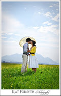
Here's a teaser shot from the bridal session I did today. It's also up on my photography blog.
I actually like it a lot more, and I can put the slippers on any corner I want (though I think I'll stick to the bottom two!), which makes it less obtrusive on a 'busy' photo.
Thoughts?


Nice logo adaptation!
ReplyDelete...that *is* a plane, isn't it?
I love this photo!!! So talented.
ReplyDeleteI like that logo. It's discreet enough that it doesn't take over the picture, but it's also something unique to you. Nice!
Yes, this is the best version of the logo. :)
ReplyDeleteI love the logo adaptation! I love love love the black border, and I love that if you wanted at some point, you could just put your name ON the photo and skip the shoes - if it was appropriate to the venue where your photos would be. Or you could use JUST the shoes, for something quirky and cute! LOVE It!
ReplyDeleteYay, it seems I have a logo winner!
ReplyDeleteAnd yes, it is a plane :-)
The other was ok, but this... is elegant. Beautifully done!
ReplyDeleteYes. Like it.
ReplyDeleteI agree with the others - this logo is better than the previous options. Still, given the choice, I would ditch the slippers and just use your name. (But that's just me.)
ReplyDelete