Since I got my DSLR, I've started noticing that I have a tendency to overexpose my pictures. I don't know why; maybe they just look prettier on the little LCD screen that way. But when I get to my computer I discover excessively bright, flat colours, with all the texture gone, and blown-out whites. And this is really stupid of me because I
know that it's easier to recover information from an underexposed photo than an overexposed one. My understanding is that once the light colours have blown out, they're gone for good, whereas if the darks are too dark, it's easier to "lift" them out (within reason). Anyway, I'm learning not to do it!
A friend of mine gave me some wedding photos her husband took on Our Day, some of which were completely overexposed. I tried and tried, but I couldn't rescue that glaring white blob that was my dress. If someone knows of a way to do this (she said hopefully), let me know!
So I decided if I wanted to "rescue" the photo and make it work at least a little, I'd have to try other methods. Not that this was actually necessary, you understand. I don't need this photo; I have lots of pictures of our cake cutting. But I had to try just for my own education :-)
Here's the original photo as I got it:

See how the white in my dress and veil, as well as the tablecloth (hello gorgeous not-blown-out damask runners!) are completely blown out? My arms aren't doing too well either, and neither is the cake, but I don't care about the latter. The less I see of that wreck the better; and besides, a cake doesn't really have texture so it's less noticeable that it's blown out.
My first job, I decided, was to crop as much of that awful white out of the photo as possible. Most of the bottom part of the table cloth could go, and so could the back of my dress and veil. And, of course, we had to get rid of that pesky arm on the left hand side!
After the crop:
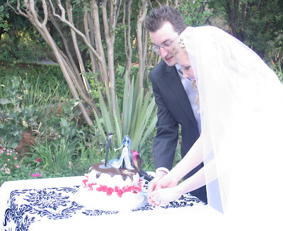
Then I had to try get as much as possible of the detail back into the white. I pushed down the contrast and the brightness:
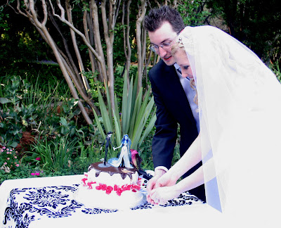
Yeah...not too much help, but I did get the photo crisper and less washed-out-looking, and I got a teeny-tiny bit of detail back in my hair! Hooray for small things, I suppose.
Next up I decided to make the photo sepia, using
Pioneer Woman's sepia action. I just thought the blown-out veil and dress would be less garish. Here's the sepia:
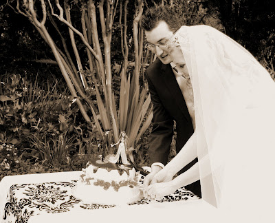
What's great about this particular action is that it runs as a layer mask automatically. I've just recently been introduced to the awesomeness of layer masks by the very same
Pioneer Woman's blog. Her explanations of Photoshop are awesome and so easy to understand. Anyway, a layer mask is basically...well, imagine you laid a transparency over your original picture. In this case the transparency was sepia-tinted, so it made the picture look sepia. But the original picture is still untouched, in colour, underneath. So if we erase bits of the mask, it will show the colour beneath. This was probably entirely unnecessary, but I wanted to practise doing this, and since I love my Corpse Bride cake toppers so much I decided to take them back to colour. I suppose this does make them more of a focal point than, say, my overly white veil. So good.
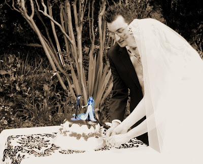
Since most of the white nastiness was at the edge of the photo, I decided to run an edge burn. This toned in well with the olde-worldy look of the sepia, and covered up a lot of the blowout:
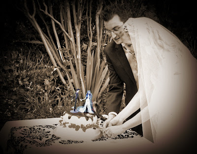
And, finally, I used another of Pioneer Woman's actions, Soft and Faded, to bring in just a bit more warmth and vintage softness:
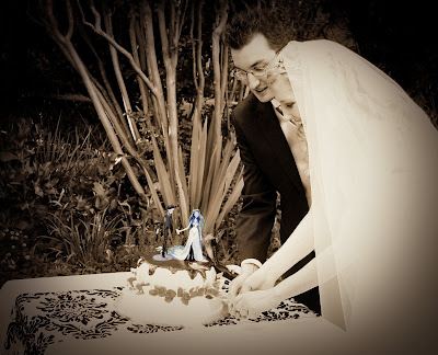
And there you have it! It's not a photo that's particularly nice, but at least I can live with it now, whereas before I would run away and hide my eyes behind a dark pillow.
BEFORE vs AFTER:
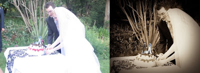
If this HAD been the only photo I had of my cake-cutting, I think I "saved" it passably...





 It's still not perfect, but it's a start.

 Problem is, I tried so many different things that I can't remember what I did! I'm fairly sure in the end I used Pioneer Woman's Heartland action but adjusted some of the layers so that it was less washed out. I darkened it with a darkening/dim the lights kind of action, and sharpened. I think I might have added a warm layer as well. Then I did an edge burn. I think!


 Actually, I think there's very little wrong with this picture. It's beautifully exposed and clear, and there are no weird shadows or sunny spots anywhere. I subscribe to the "if it ain't broke" school of photoshop; that is, since this picture is so lovely I'm not going to mess with it too much and do all sorts of weird effects and softness and odd things. I did, however, decide that I needed to get in closer on his face, so I cropped in a bit, and then I decided that his expression and big eyes would be best served by making the photo black & white. Babies and amall children look gorgeous in black & white, in my opinion. Before I converted it I lightened and sharpened his eyes, just to bring them out. And voila:
 Such a sweet, beautiful boy.


 And, finally, I used another of Pioneer Woman's actions, Soft and Faded, to bring in just a bit more warmth and vintage softness: