As you guys know (and if you don't, tsk! Pay attention!) I'm in the early stages of attempting to start a photography business. Right after I figure out the ins and outs of what's required, that is. In the meantime, I've started thinking about branding and logo design. I've got Mr Ruby Slippers working on a logo right now, which I think is going to be frikkin AWESOME, but I thought I'd ask for input from my readers on what you like to see in a photographer's logo, what makes it memorable for you (and, indeed, which ones ARE memorable), and anything else you can think of that works or doesn't work for you when it comes to a photographer's layout/design, categories, etc. I'll be starting a new, dedicated photography blog for my business, and probably keeping this one as my personal blog (until I run out of things to say, or it all ends up being on the other blog anyway!), so feel free to tell me what you'd like to see or not.
I've decided on the logo itself (which is what Mr Ruby Slippers is designing) but I still need a font to use for my name, because the logo is just a picture which will be either above my name or between the words, depending on which looks better. Once I have said logo I'll share it with you. In the meanwhile, here are some of my favourite photographer logos/branding:

I love the sweet little curly logo that
Photos for Life uses, and I really love their font, too!
 Chelsea Nicole
 has a great logo because it's just her name, but the colours and font really stand out and make it memorable.

I think this one for
Studio Julie's Pink Light District Line is really fun! I love the vintagey lamp. I think it might be a bit big for some purposes, though.

This is my absolute favourite logo, from
theorie. The cute, bouncy font, with that sweet butterfly hanging off it (I adore butterflies. Seriously, you should see how many butterfly necklaces I have) is just swoonworthy. I love the way the name and the logo are part of each other. Le sigh.
Don't worry, theorie, I'm not stealing your butterfly!
I always liked photo logos and names that lie beneath the photo, so that no part of the photo is obstructed, but I've just shown four that are ON the photo, and they all look lovely. I think it's better from the point of view of people not being able to crop your name off your photo as easily. What do you guys think?
For ones below the photo, these are some more I like:

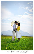
The famous (infamous?)
Jessica Claire's logo. (PS I heart this photo!)

I love the way
Jonilyn's flower cuts through her name.

How about part on, part off, like
Jessica Johnston?Anybody have any other favourites, or reasons to like or not like those I've posted? Bring it on!