30 May, 2009

That Wife's May Food Challenge

Jenna over at That Wife has been issuing these photo challenges for months, but I've always been too lazy to enter. Yeah, yeah, I know, I'm terrible. Anyway, the challenge this month was to get your Mom to give you a recipe that she had always made, and make it yourself. I decided this was a Good Thing because my mother is a good cooker of tasty things, and I should have more of her recipes. And especially, I need to bake more. I never bake, which is stupid because I adore baked goods. I'm just, well, lazy about it.

On thinking about cake-making, I realised that part of the reason I never bake a cake is because it seems like a mission. Often you have to make two layers and put them together with something yummy in the middle, and then you have to ice the whole thing. Way too much effort for this lazy Slipper! And at that moment, I thought of my mom's lemon loaf cake. It's lemony and yummy and it has no icing or middle creamy bit! I immediately asked her for the recipe, and I made it yesterday afternoon.


RECIPE FOR LEMON CAKE

INGREDIENTS
CAKE
225ml Castor Sugar
400ml Flour
10ml Baking Powder
125g softened margarine
2 eggs
Rind of 1 Lemon
125ml Milk

TOPPING
125ml Castor Sugar
50ml Lemon Juice


METHOD
Cake:
Sift dry ingredients. Add everything else and beat well with an electric beater. Pour into cake tin. Bake at 180C for 45-60 minutes until done. Turn cake out.

Topping:
Mix lemon juice and castor sugar and pour over cake while it is still hot. Garnish with a little grated lemon rind.


It looks like it could be kind of dry and boring, right? But all the yumminess is in the lemon juice & sugar topping. It makes the top all shiny and sticky, and because you put it on when the cake is hot, it soaks through into the cake and makes it moist and lemony inside too. Yummmm.

The original recipe calls for a loaf pan, but I used a round one because it has a greater surface are to pour the lemon juicy goodness on. (That and I don't actually own a loaf pan, but whatever).

Easy-peasy cake! Thanks, Mom! :-)

29 May, 2009

I ♥ Faces Fix-it Friday


It's Fix-it Friday over at I ♥ Faces! This is the first time I've done one of their challenges...but hey, I love me some Photoshop practise!

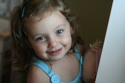
This is the "before" picture they put up:


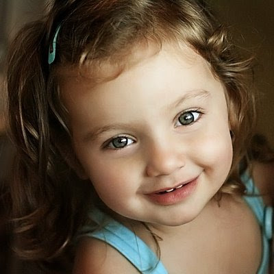
And here's my edited version:


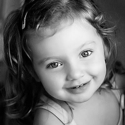
It also looks beautiful in black & white:


What I did:

1) Cropped to a square
2)Used Image > Adjust > shadows/highlight to lighten the shadow on her face
3)Pioneer Woman's 'Warmer' action
4)Used the Clone and Spot Healing brush tools to fix the imperfections in her face and even out the colour
5)Lightened and sharpened the eyes
6)Pioneer Woman's soft & faded action at 30% with some tweaking off inner layers
7)Burned the edges
8)Filter > Noise reduction

And then for the b & w I added Pioneer Woman's B&W Beauty with bump at 40%

All in PS3.

Bridal Shoot!

Simone's Bridal Shoot at the Military Museum is up on my photography blog! At least, Part I of it is. :-) There were so many pictures I loved I think it will definitely have to be a two-parter!

Go see it here.

Here's a teaser (another one!)

28 May, 2009

Loves & Loathes

So not much is up at the moment in the usually-mad world of the Ruby Slippers'. So I thought I'd do a little post about things that I'm loving at the moment, and things that are just ticking me off!

At the moment, I lurve:

1) Salmon & Avo California rolls.

YUM. I don't know why I'm so addicted to them at the moment, but I could eat a pile of these babies everyday. Salmon plus avo plus seaweed plus those little seeds must be the best flavour EVER. (this pic isn't right, but it's the closest I could find. I like it when they have seeds on the outside!)

2) Woolworths double cream coconut yoghurt.

I've basically been eating this for lunch nearly every day for months (with fruit, of course, but not together!). I have a weakness for anything coconut. Best drink I ever had was a coconut shake in Thailand.

3) Monopoly.


Mr Ruby Slippers and I have been playing this a bunch lately. I brought over my old set that I got for my 7th or 8th birthday, and it still works. :-) Tonight we played two games... One All.

4)The soundtrack of Sweeney Todd (Broadway cast with Patti Lupone; not the putrescent mess that was the Tim Burton film. Ugh.)

What an awesome musical. If you hated the movie but expected to like it, try getting hold of one of the dvd concert versions with either Angela Lansbury or Patti Lupone starring with George Hearn. Both are excellent.


And I'm Loathing:

1) People who close the stall doors in public toilets so you think someone is in there. Seriously, are you just trying to make people wait in line so you can point and laugh? It's people like you that make other people push on the doors when you are in there, because they think it's possible no one is. And I hate that, especially if the catch is a bit iffy and the door doesn't stay closed properly.

I don't have a picture for this.


2)Cooked raisins.

I'll eat them out the bag (raw, I guess, though that seems an odd term for a dried fruit), but by golly I do not like them cooked in buns (see above), apple pie, etc. Uuuugh. They get all bloated and disgusting. Shudder.


3)Electric Gates that close automatically after a few seconds. They terrify me. I've had a few narrow shaves with these bastards, and I find them completely unnecessary. What, so you have one in case you possibly forget, one day in the future, to close the gate? Isn't it far more likely that someone's car will get pranged by by the stupid thing closing on them?


4) Car guards in parking lots. I'm sick of them saying hello and goodbye in that wheedling tone and expecting me to give them money. Gah. Could we just have a parking lot safe enough not to need guards??

Funny how you can't find pics of the bad stuff...

Movies watched! I keep forgetting about this:

Star Trek - Pretty good. I used to date a Trekkie, so I saw all the recent films, and this one was definitely better! I got a bit distracted trying to count every time there was flare, though.
Into the Woods - the Sondheim musical in concert. LOVED it.
Bride Wars - Hey, it wasn't as bad as everyone made out. Watchable, but probably not rewatchable.
My Fair Lady - One of my top musicals of all time. I hear they're doing a remake; whyyyyyy??
The Wizard of Oz - Ditto, except for the remake bit. It has Judy and it's magical. That's all there is to know.
The Princess Bride - Not really; I just watched the commentary on the new edition. This was my favourite movie for years, and it's the one I can quote pretty much by heart. Which led to me quoting lines while Rob Reiner was talking...

(It looks like I've fallen off a bit here, but in between this I did watch seasons 3, 4 and 5 of The Nanny, and a bunch of other tv...)

Have a good weekend, everyone!

25 May, 2009

Teaser & new logo


Here's a teaser shot from the bridal session I did today. It's also up on my photography blog.

I actually like it a lot more, and I can put the slippers on any corner I want (though I think I'll stick to the bottom two!), which makes it less obtrusive on a 'busy' photo.

Thoughts?

23 May, 2009

Photo of the Day

Guys, I'm sorry I haven't posted this week. I've been sick with flu, as well as just feeling a bit overwhelmed by life in general. I appreciate all your responses on my logo issue, and I've actually been fiddling around with a different take on it (thanks, Galadriel) to see if I can get more consensus on it. IE, more people telling me that it's good, instead of half and half :-) Heheh. I'll debut that soon.

In the meantime, I'm going to go and cough my head off, so I'll leave you with a photo by Funkytown Photography. I'm all about the grunge at the moment.

16 May, 2009

My Logo - EDITED for an Extra Option (17 May)

Mr Ruby Slippers has finished my logo, I've chosen a font, and I'm pretty damn pleased with the results! But I need advice from all of you about WHERE to put it on the photo. I originally liked the idea of placing the logo slightly over the photo, and I posted one lot like that, but then I started worrying that it looked too cluttered. As if in answer, someone kindly left a comment on that post, saying that they found it too distracting. So I've tried moving it back down into the white border. Now you guys look at these three and tell me which you like best:

OPTION 1:
Option 1 has the slippers slightly over the picture.

**EDIT** I thought maybe it was looking cramped because the white block was too small, so I made that bigger. We'll call this Option 1a:


OPTION 2:

Option 2 moves that logo down so that it's all in the white border block, and makes the white border bigger as well.


OPTION 3:

Option 3 uses the same size white block as Option 2, but the Ruby Slippers have been moved slightly down to be more on level with the text.


Which do you like best? Or suggest anything else you think might work! I'm open to ideas.

14 May, 2009

Adsense

Do any other bloggers use adsense to make money on their blog? Is it a good option, or do the ads everywhere just annoy people? Also, I'm hesitant about giving out my personal details and/or banking details to "some company on the internet". What do you guys think?

13 May, 2009

Photography Blog

Hi everyone,

My new photography blog is up at http://katforsythphotography.co.za

It's not complete yet (the logo is coming, I promise!) but I've put lots of photos up in the meantime!

Go check it out.

I'm FEATURED on Cake Wrecks!

Is this a good thing? Why, yes. My wedding cake was hideous and we all know it, and Cake Wrecks is bloggy awesomeness that often makes me cry with laughter. Just not usually at my own expense.

Still, if I can bring a little joy into your humdrum lives, it means my cake wreck aint been in vain for nothin'.

Go see it here.

11 May, 2009

Thunderclouds, any clouds

We have been having some bizarrely stormy weather lately. It doesn't usually rain at this time of year. That also means we've been having some amazing cloud cover, and - occasionally - spectacular sunsets. Here are some cloud pics I took over the last week.

Note: I didn't change the colour on any of these, except one where I added a smidge of a pink filter. I've boosted and upped contrast and all that sneaky stuff, of course, but the colours are really that gorgeous in real life. I was in cloud heaven.


This is from my bedroom window. See that white dot in the low cloud above the tree? That's the moon. Seriously. I took this at about 5:40pm.


It got darker right before my eyes. Before I knew it, the pink was all gone.


This was a different day, different sunset. The gold on this cloud made me want to marry it.


This one looks really fake, right? It's not. A storm blew up over a bright blue sky, and before you could say "faked in photoshop" there was this massive black swirling mass of evil over a powder-blue, My Little Pony sky. I swear, this cloud could BE a My Little Pony bad guy, come to ruin their Pony fun and rainbow happiness.


On another day, Mr Ruby Slippers and I jumped in the car and drove down to a nearby school, where we took pictures from their playing field. Unfortunately we missed the actual sunset (this was PINK when we got in the car five minutes before!) But I think it's gorgeous like this too:


This is the one I added the pink cast to. It just made it less blue-grey and more sunsetty. You can barely see the pink, right? That's cos it was so overpoweringly blue before.


This is right before we left the house to take the two above. See? It was pink!


And purple and grey and white and lilac and mauve and GORGEOUS. Swoon. I want to marry this one too.

It must be so sad not to appreciate the beauty in nature.

08 May, 2009

Photographer Friday: Joy Marie

Today's gorgeousness overload comes from the ultra-talented Joy Marie...


07 May, 2009

Random photo I took and liked

This could be the beginning of another Photo of the Day Series, but this time MINE. We'll see. I don't know if I take enough photos for that :P

So the other night this moth came and landed on the books on my bedside table. He picked a great one because the metallic red cover reflected onto him beautifully. I leaned over and picked up my camera out of its bag by my bed, and got this:

Pretty.

A Flashing Sign

Ever since I went mad and quit my job to do photography (yes, that is to be said with an ironic twisted smile) I've always had this idea that if I got into dire financial straights, I could return to my previous-previous job (that is, two jobs ag0) at a big chain bookstore. Maybe just parttime, but I know they're always looking for people, and they'd be happy to have me back because I was totally good at my job. Book knowledge coming out of my ears (not, I hasten to add, because I've READ that many books, but I'm really good at recalling details).

So tonight my friend Simone and I went out for a chick flick. In this case, Confessions of a Shopaholic.* And afterwards we stopped in at our old bookstore (we both used to work there, but she got out before I did) to say hello to some of the nightstaff we used to know. And while we were there this bizarrely rude man came up to us (we were standing at the counter talking to the night manager) and started asking odd questions, and then getting angry when no one could understand what he wanted. He stormed out and then stormed back in again, pointed at random customers and asked "Who's that? Who's that?" and then stormed off towards the back of the shop when one of the staff answered, "They're customers...?"

A few minutes later he came back and said rudely at all of us, "I'm going now. Thanks for all your help!" I didn't see why Simone and I, who were standing on the outside of the counter and clearly not staff, should be included in this, so I said - politely, honestly - "Actually, she and I aren't staff; we were just talking to them." And he came back right up to us and said, "Why did you lead me to believe you were staff, then?" (???????) And Simone said, "Well, some of the people standing here are staff, but we aren't." And he gets right in her face and goes, "I suppose you think it's fun to belittle people like that, huh? Does it make you feel better?"

Seriously, What The Fuck.

Funnily enough, Simone was one of the more polite people we ever had on staff, so this was pretty weird and uncalled for. But this man was clearly off his rocker. A few clowns short of a circus. A couple of sandwiches short of a picnic. A few grapes shy of a bunch. Lift not going anywhere near the top storey. Oxen most of the way out the kraal. Etc.

And what did this say to me? In a giant, flashy, neon sign:

I AM NEVER WORKING RETAIL AGAIN, AS LONG AS I LIVE.

So there goes that back-up job. Oh well. I would have had to have been pretty desperate, anyway.

*This reminds me, I was supposed to be listing the movies I watched in every post, and I forgot. Go away now if you don't care. :-)

Everything I watched since the last time I did this:

Neverwhere - Actually a miniseries which I gave Mr Ruby Slippers for his birthday. I love the idea (I'd read the Neil Gaiman novel ages ago) but the effects were pretty, well, budget-friendly.
French Lieutenant's Woman, The - Nice Enough, but ultimately unmemorable. Meryl is fab, though (when isn't she?)
Eulogy - This was supposed to be as good as Death at a Funeral. It wasn't.
Hoodwinked - Always fun! If you haven't seen this, go rent it! It's so cute.
Calendar Girls - Hilarious Brit-com. Love it.
Shaun of the Dead - See above. Even funnier.
What's Up, Doc? - One of my favourite movies of all time. I watched this to perk up the night before I shot my first wedding.
Easter Parade - Guess when I watched this. It's Judy Garland, and is therefore a treat.
Minority Report - I really enjoy this movie. Great futuristic sci-fi action.
Little Mermaid, The - Twenty years since I first saw it, and I still love it.
Presenting Lily Mars - It's Judy Garland, and is therefore a treat.
Mermaidia - No funny looks. I borrowed this from Tanja's daughter. It has a very My Little Pony sweet simplicity, and I lurve under-the-sea stuff.
Honey I Shrunk the Kids- Fun family comedy classic.
For Your Consideration - As offbeat as Christopher Guest's comedies usually are.
Lost in Austen - BRILLIANT. It's actually also a miniseries, but it feels like a 3-hour movie. I can't begin to say how much I enjoyed this. If you like Pride & Prejudice, rent this!
Wild Child - What can I say, I like school movies. It was fun but average.
Twilight - Better than I expected, but not as good as the book.
Mame - RIP Bea Arthur. You were the best thing in this tired-feeling movie. If you don't watch it very often it's okay, though.
Wolverine - Hugh Jackman runs around naked. SOLD. (Actually it's fun but not great).
Last Chance Harvey - Meh. It should have been funnier, but ultimately it's a lacklustre drama. I just love Emma Thompson, though.
Confessions of a Shopoholic - Light and frothy, and barely sticking to the books, it's sweet but forgettable.

THE END

03 May, 2009

Logo-ing my business

As you guys know (and if you don't, tsk! Pay attention!) I'm in the early stages of attempting to start a photography business. Right after I figure out the ins and outs of what's required, that is. In the meantime, I've started thinking about branding and logo design. I've got Mr Ruby Slippers working on a logo right now, which I think is going to be frikkin AWESOME, but I thought I'd ask for input from my readers on what you like to see in a photographer's logo, what makes it memorable for you (and, indeed, which ones ARE memorable), and anything else you can think of that works or doesn't work for you when it comes to a photographer's layout/design, categories, etc. I'll be starting a new, dedicated photography blog for my business, and probably keeping this one as my personal blog (until I run out of things to say, or it all ends up being on the other blog anyway!), so feel free to tell me what you'd like to see or not.

I've decided on the logo itself (which is what Mr Ruby Slippers is designing) but I still need a font to use for my name, because the logo is just a picture which will be either above my name or between the words, depending on which looks better. Once I have said logo I'll share it with you. In the meanwhile, here are some of my favourite photographer logos/branding:

I love the sweet little curly logo that Photos for Life uses, and I really love their font, too!


Chelsea Nicole has a great logo because it's just her name, but the colours and font really stand out and make it memorable.


I think this one for Studio Julie's Pink Light District Line is really fun! I love the vintagey lamp. I think it might be a bit big for some purposes, though.


This is my absolute favourite logo, from theorie. The cute, bouncy font, with that sweet butterfly hanging off it (I adore butterflies. Seriously, you should see how many butterfly necklaces I have) is just swoonworthy. I love the way the name and the logo are part of each other. Le sigh.

Don't worry, theorie, I'm not stealing your butterfly!

I always liked photo logos and names that lie beneath the photo, so that no part of the photo is obstructed, but I've just shown four that are ON the photo, and they all look lovely. I think it's better from the point of view of people not being able to crop your name off your photo as easily. What do you guys think?

For ones below the photo, these are some more I like:


The famous (infamous?) Jessica Claire's logo. (PS I heart this photo!)


I love the way Jonilyn's flower cuts through her name.
How about part on, part off, like Jessica Johnston?

Anybody have any other favourites, or reasons to like or not like those I've posted? Bring it on!

02 May, 2009

Baby K

I did a shoot with sweet little 10-week-old baby K last week. He's so adorable, it almost makes me want one of my own. Luckily he vomited and I got over it :-)

He's still adorable, though.


Look at that furrowed brow! I could die.


Babies have the CUTEST facial expressions! "You did what with a WHAT?"


Tiny feetsies! They make my heart go pitterpat.


I love how he's trying to look at the dangling mobile with his eyes AND lips!


Thank Heaven for Little Boys...


I'm in love with this one:


If this had a caption, it would be, "Sup, ladies?"

But all that shmoozing is tiring...


Thanks to K's parents for letting me haul their precious bundle around. Such a sweetie!