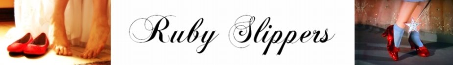
OPTION 1:
 Option 1 has the slippers slightly over the picture.
**EDIT** I thought maybe it was looking cramped because the white block was too small, so I made that bigger. We'll call this Option 1a:

OPTION 2:
 Option 2 moves that logo down so that it's all in the white border block, and makes the white border bigger as well.
OPTION 3:
 Option 3 uses the same size white block as Option 2, but the Ruby Slippers have been moved slightly down to be more on level with the text.
Which do you like best? Or suggest anything else you think might work! I'm open to ideas.


Isn't part of the reason for placement of the photo, putting the logo ON the picture, to emphasize that it's just a proof/display? Putting it slightly over the edge is certainly preferable to emblazoning it across the middle of the pic, obscuring the contents. And it still emphasizes that it's your photo, no copying without permission please.
ReplyDeleteI don't have a preference between 2 or 3 but I definitely don't like #1. I just hopped over to your photography blog and I feel like having the slippers on the photo takes away from the picture itself.
ReplyDeleteI was wondering the same thing as stated by Galadriel. I thought it was actually supposed to go over the edge some. That said, I like the shoes level with the writing.
ReplyDeleteI say option 2 for keeping it off the pictures. The slightly higher shoes draws my eye upwards toward the picture more than when it's all level.
ReplyDeleteI prefer #1, #2 not bad either if you don't want the shoes on the picture at all, just something about option #1 draws my eye more.
ReplyDeleteFirst of all, I love the logo, it's so cute! I prefer when it's not on the picture, though I also thought that was kinda the requirement you were looking for. #2 is my personal fav.
ReplyDeleteVery cute! I like #1. I think adding the extra white space in #1a makes the logo part of the photo too large, and you notice it more, whereas in #1 it blends with the picture. I think having the slippers a little bit over the picture is more cohesive, but it does have the possibility of getting in the way. In the example picture you gave us, it doesn't matter if the slippers overlap a little bit of the grass; however, if the picture were something like a close-up face shot, the slippers might be a bit intrusive. If you go for slippers NOT overlapping the picture, I prefer #3. To me, #2 looks like the logo is meant to overlap the picture but doesn't. #3 looks like it is meant to sit below the picture. Eek, this was long... hope it helped!
ReplyDeleteOh dear, you guys are all telling me different things that all make sense! No consensus yet, and now I can't decide either!
ReplyDeleteI like #2. I like the slippers above the text, but not on the photo. :)
ReplyDeleteI like the smallest white space of #1, but I don't particularly care for the slippers. In my opinion, they're a bit distracting. (Sorry.)
ReplyDeleteSo basically I just have to make up my own mind about what *I* like, because you guys all have different opinions! Heheh. Personally, I love the slippers, so I hope that too many people don't find them distracting in the future. Also, I THINK I'm leaning towards having them off the picture. But I like it both ways :-)
ReplyDeleteI'm also a fan of #1! Hope that helps! :)
ReplyDeleteI like #1, but I think I'd like it even more if the text also had a bit of overlap, so #1, laid out like #3.
ReplyDeleteI think you should do th slippers with your name above them and the Photography below :) And place that on the photos. Make it a png file with white text and with black and then you should be able to resize it and slap it on any photo! :)
ReplyDeleteI like #3
ReplyDeleteok so here is an idea out of left field, because why not give you more options. Two things... first, the slippers shouldn't be inline with the text, second, have your logo at the bottom without the extra white space, but add your logo maybe just the slippers as watermark across the photo, to make sure no one "borrows" it.
ReplyDeleteI like where 1(a) is going. When graphics break their field, it seems that the two elements (business and art) are bridged.
ReplyDeleteYou're getting a lot of suggestions. I say go with what you like best.
But, well, okay, the slippers — which are good — don't seem to match the photo. It's a bunch of guys. How do slippers fit in with them?
BUT, your name is legible (where would your contact info go?) and the image is unique enough that people would recognize it again.
contact information ON the photograph?
ReplyDeleteWhat if you did something like this?
ReplyDeletehttp://picasaweb.google.com/elfchick/PublicImages#5337991593986610546
Galadriel - that's a good idea. I'll try something like that and see how it looks. Sorry I haven't come back to anyone on this; I have flu. Blech.
ReplyDeleteGaladriel's idea is good and i also like option "3"
ReplyDeleteI just found your blog via cakewrecks, I hope it's okay to give my 2 cents!!
ReplyDeleteI like the shoes slightly over the picture, but the writing far enough below in the white space to not look scrunched in. I browsed you photos and you take awesome pictures!!