
I'm showing Ed's before and after shot first, and then in each case I cropped the "before" picture and used that in photoshop to try get it looking exactly like Ed's "after" shot.


Do you see the problem I'm seeing? If not, good. Now tell me how talented I am.
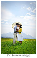
If you do, and it's the same problem I'm seeing, it's that Ed's shots have a much prettier, softer, pinky tinge to them. Mine come more washed out and yellower. Look at the cake picture. The wall behind it should be pink, but mine is orange. The little girl (the result I'm least happy with) in picture 3 is a lot more, well, jaundiced than the pretty pinky girl she is in the real "after" shot. The shadow on the girl's chin in the first picture is far too yellow; the original pic has them quite pink; almost red in spots. And I've managed to wash out the colour in her face too.
I don't think my pics look BAD, but they're just not as pretty as they should be!
Photoshop for Dummies, here I come....


I think you did quite well. I'm very impressed actually. Remember that he is processing raw images, and you are processing very low resolution JPGs. It definitely would make a difference and prevent you from achieving the exact same results.
ReplyDeleteI didn't notice until you spelled it out for me, they all looked super pretty at first. hehe ;)
ReplyDeleteThanks, guys! Jenna, if you're impressed, then I must be doing SOMETHING right! You're right about the full res RAW files vs teeny JPGs, but I still want it to be less washed-out looking!
ReplyDeleteI've been playing on PS all frikkin day! It's such fun. I'm clueless but learning!
Well done. the Profile will also make a difference hey. Remember what I showed you yesterday with the Adobe (1998) and the sRGB. They still won't look exact but it can only help.
ReplyDeleteAlso he has applied vignetting Like I showed you yesterday as well. If you look at the 2nd one you can see it big time... in his the grooms hair is darker and the out of focus white thing on the bottom right is also darker.
But really you did well :P so just keep practicing!
Thanks, Tanya. I get nervous when I see you leave a comment on my photography skills! Haha. Yeah I don't know how I didn't notice the vignetting before! I just didn't see it or think about it...but now I know :-) Thanks for all your awesomeness!
ReplyDeleteI'm not sure what process you're using, and my suggestion could sound really clunky and amateurish, but...
ReplyDeleteI've always thought that in a pinch, [ Image > Adjustments > Variations... ] can be a lifesaver (in this case, by adding a touch more blue). ;)
Sounds to me like you just need to tinker with your color values to tone down the yellow and lift the pink tones, and it looks like maybe some sort of soften filter. Between the two (and maybe a little masking), I think you'd be spot on. Good work! (I had to have it pointed out, too :)
ReplyDelete=)
ReplyDeletemake sure you don't use photoshop as a crutch with photos. good light and composition is 1st when making awesome photos... then use a processing software to really give it that "WOW" factor.
hope your season is great!
best,
//ed
Wow, thanks, Ed! I'm glad you didn't mind me using your photos to mess around with. That's great advice, and thank you for coming to my little old blog :-)
ReplyDelete